ionic tutorial - Ionic Button - ionic - ionic development - ionic 2 - ionic framework
- Buttons are simple components in Ionic.
- They can consist of text and icons and be enhanced by a wide range of attributes.
- There are several types of buttons in Ionic Framework and all of the buttons are animated which enhances user experience when using your app.
- Main class for all button types is button.
- This class will always be applied to our buttons, and we will also use it as prefix when working with sub classes.
ionic tutorial . extension , ionic framework , ionic , ionic framework book , ionic app example , ionic templates , ionic getting started
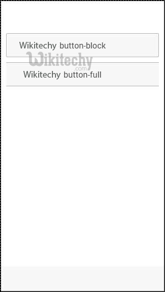
Block Buttons
- Block buttons will always have 100% width of their parent container. They will also have small padding applied.
- You will use button-block class for adding block buttons. If you want to remove padding but keep full width, you can use button-full class.
- Following is the example to show the usage of both classes:
<button class="button button-block">
  wikitechy button-block
</button>

<button class="button button-full">
   Wikitechy button-full
</button>
Click below button to copy the code. From wikitechy - ionic tutorial - ionic framework tutorial - team
- Above code will produce following screen:
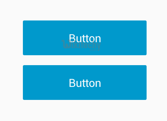
Button Size
- There are two Ionic classes for changing button size:
- button-small and button-large.
- Following is the example to show the usage:
<button class="button button-small">
    button-small
</button>

<button class="button button-large">
    button-large
</button>
Click below button to copy the code. From wikitechy - ionic tutorial - ionic framework tutorial - team
ionic tutorial . extension , ionic framework , ionic , ionic framework book , ionic app example , ionic templates , ionic getting started
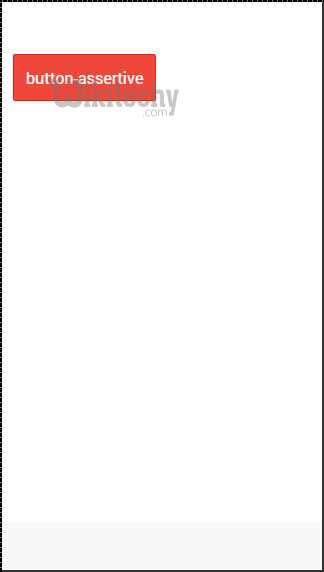
Button Colors
- If you want to style your button you just need to add appropriate color class to it.
- It can change the color automatically. When you style your elements you need to add your main element class as prefix to your color class.
- Since we are styling footer bar, the prefix class will be bar and color class that we want to use in this example is assertive (red).
<button class="button button-assertive">
    button-assertive
</button>
Click below button to copy the code. From wikitechy - ionic tutorial - ionic framework tutorial - team
- Above code will produce following screen:
- You can use either of the following nine classes to give a color of your choice to your app buttons:
| Color Class | Description | Result |
|---|---|---|
| button-light | To be used for white color | |
| button-stable | To be used for light grey color | |
| button-positive | To be used for blue color | |
| button-calm | To be used for light blue color | |
| button-balanced | To be used for green color | |
| button-energized | To be used for yellow color | |
| button-assertive | To be used for red color | |
| button-royal | To be used for violet color | |
| button-dark | To be used for black color |
ionic tutorial . extension , ionic framework , ionic , ionic framework book , ionic app example , ionic templates , ionic getting started
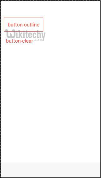
Button Outline
- If you want your buttons transparent you can apply button-outline class. Buttons with this class will have outline border and transparent background.
- To remove border from button you can use button-clear class. The example below shows how to use these two classes.
<button class="button button-assertive button-outline">
    button-outline
</button>

<button class="button button-assertive button-clear">
   button-clear
</button>
Click below button to copy the code. From wikitechy - ionic tutorial - ionic framework tutorial - team
- Above code will produce following screen:
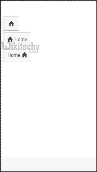
Adding Icons
- When you want to add Icons to your buttons, the best way is to use icon class. You can place icon on one side of the button by using icon-left or icon-right.
- You will usually want to move your icon to one side when you have some text on top of your button as showed below.
<button class="button icon ion-home">
</button>

<button class="button icon icon-left ion-home">
   Home
</button>

<button class="button icon icon-right ion-home">
   Home
</button>
Click below button to copy the code. From wikitechy - ionic tutorial - ionic framework tutorial - team
- Above code will produce following screen:
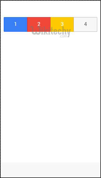
Button Bar
- If you want to group couple of buttons together you can use button-bar class. The buttons will have equal size by default.
<div class="button-bar">
   <a class="button button-positive">1</a>
   <a class="button button-assertive">2</a>
   <a class="button button-energized">3</a>
   <a class="button">4</a>
</div>
Click below button to copy the code. From wikitechy - ionic tutorial - ionic framework tutorial - team
- Above code will produce following screen: