ionic tutorial - Ionic Grid | Ionic - Grid - ionic - ionic development - ionic 2 - ionic framework
- Ionic grid system is based on flexbox, a CSS feature supported by all devices that Ionic supports.
- The grid is a powerful mobile-first flexbox system for building custom layouts. It is heavily influenced by Bootstrap's grid system.
- The grid is composed of three units - a grid, row(s) and column(s). Columns will expand to fill their row, and will resize to fit additional columns. It is based on a 12-column layout with different breakpoints based on the screen size.
- The number of columns and breakpoints can be fully customized
- Working with the Ionic grid system is straightforward. The main classes are row for working with rows and col for columns.
- You can choose as much as columns or rows you want. All of them will adjust its size to accommodate available space, although you can change this behavior to suit your needs.
- NOTE − All examples in this tutorial will have borders applied to our grid to be able to display it in a way that is easy to understand.

Simple Grid
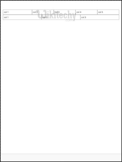
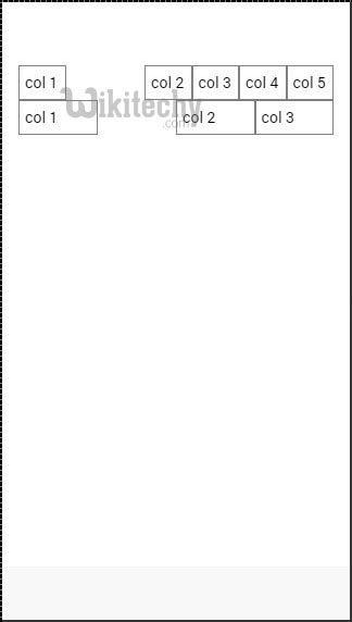
- Example below shows how to use col and row classes. We will create two rows. First row will have five columns, and the second one will have only three.
- Notice how width of columns is different in first and second row.
<div class = "row">
   <div class = "col">col 1</div>
   <div class = "col">col 2</div>
   <div class = "col">col 3</div>
   <div class = "col">col 4</div>
   <div class = "col">col 5</div>
</div>

<div class = "row">
   <div class = "col">col 1</div>
   <div class = "col">col 2</div>
   <div class = "col">col 3</div>
 </div>
Click below button to copy the code. From wikitechy - ionic tutorial - ionic framework tutorial - team
- Above code will produce following screen −
Column Sizes
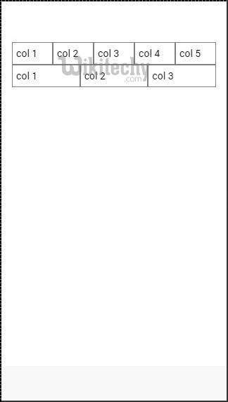
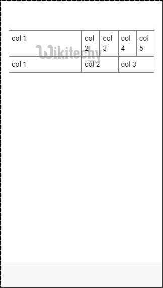
- Sometimes you don't want to leave column sizes automatically assigned. If this is the case you can choose col prefix followed by a number that will represent a percentage of the row width.
- This will apply only to the column with specific size applied. The other columns will adjust to the available space that is left.
- In the example below first column will use 50 percent of the full width and the others will adjust accordingly.
<div class = "row">
   <div class = "col col-50">col 1</div>
   <div class = "col">col 2</div>
   <div class = "col">col 3</div>
   <div class = "col">col 4</div>
   <div class = "col">col 5</div>
</div>

<div class = "row">
   <div class = "col col-50">col 1</div>
   <div class = "col">col 2</div>
   <div class = "col">col 3</div>
</div>
Click below button to copy the code. From wikitechy - ionic tutorial - ionic framework tutorial - team
- The above code will produce following screen −
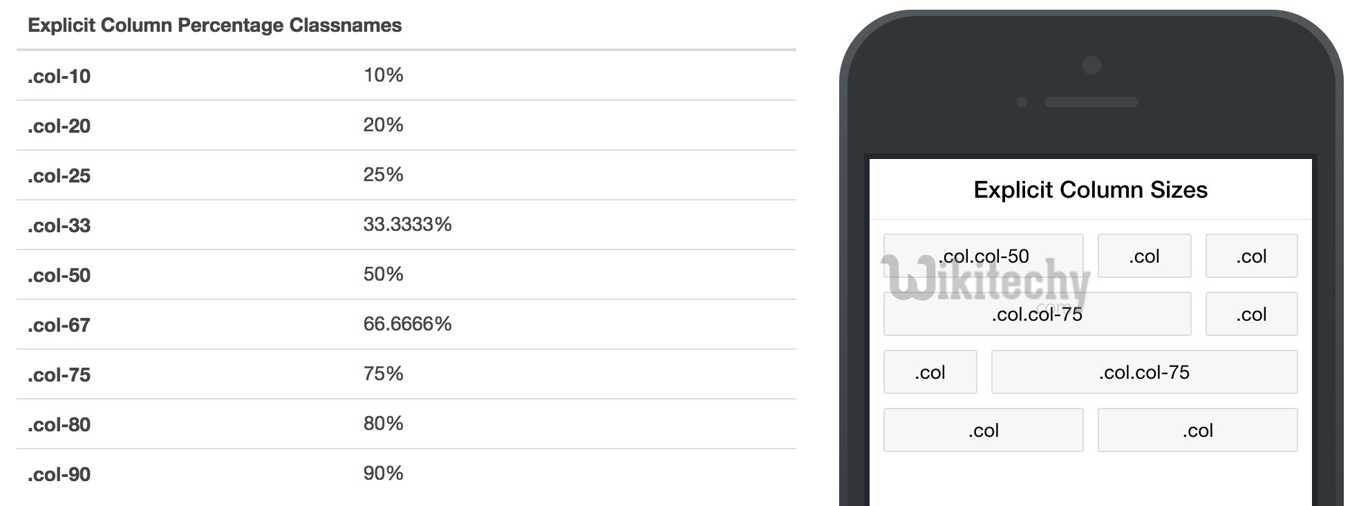
- Following table shows available percentage options that Ionic grid system provides −
ionic tutorial . extension , ionic framework , ionic , ionic framework book , ionic app example , ionic templates , ionic getting started
Column Percentage Classnames
| Class Name | Percentage Used |
|---|---|
| col-10 | 10% |
| col-20 | 20% |
| col-25 | 25% |
| col-33 | 33.3333% |
| col-50 | 50% |
| col-67 | 66.6666% |
| col-75 | 75% |
| col-80 | 80% |
| col-90 | 90% |
ionic tutorial . extension , ionic framework , ionic , ionic framework book , ionic app example , ionic templates , ionic getting started
Horizontal and Vertical Positioning
- The columns can be offset from the left. It works the same as the specific size of the columns.
- This time prefix will be col-offset and then we will use the same percentage numbers showed in the table above.
- Following example shows how can we offset second column of both rows by 25 percent.
<div class = "row">
   <div class = "col">col 1</div>
   <div class = "col col-offset-25">col 2</div>
   <div class = "col">col 3</div>
   <div class = "col">col 4</div>
   <div class = "col">col 5</div>
</div>

<div class = "row">
   <div class = "col">col 1</div>
   <div class = "col col-offset-25">col 2</div>
   <div class = "col">col 3</div>
</div>
Click below button to copy the code. From wikitechy - ionic tutorial - ionic framework tutorial - team
- Above code will produce following screen −
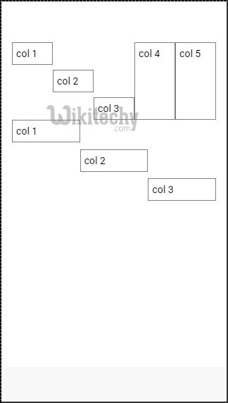
- You can also vertically align columns inside a row. There are three classes that can be used: top, center and bottom class with col prefix. Code belows shows how to place vertically first three columns of both rows.
- NOTE − In the example that follows we added.col {height: 120px} to our CSS to show you columns vertical placing.
<div class = "row">
   <div class = "col col-top">col 1</div>
   <div class = "col col-center">col 2</div>
   <div class = "col col-bottom">col 3</div>
   <div class = "col">col 4</div>
   <div class = "col">col 5</div>
</div>

<div class = "row">
   <div class = "col col-top">col 1</div>
   <div class = "col col-center">col 2</div>
   <div class = "col col-bottom">col 3</div>
</div>
Click below button to copy the code. From wikitechy - ionic tutorial - ionic framework tutorial - team
ionic tutorial . extension , ionic framework , ionic , ionic framework book , ionic app example , ionic templates , ionic getting started
Responsive Grid
- Ionic grid can also be used for responsive layout. There are three classes available. responsive-sm class will collapse columns into single row when the viewport is smaller than landscape phone.
- responsive-md class will be applied when viewport is smaller than portrait tablet. responsive-lg class will be applied when viewport is smaller than landscape tablet.
- First image after following example shows how responsive-sm class looks on mobile device and second one shows how the same responsive grid looks differently on Tablet device.
<div class = "row responsive-sm">
   <div class = "col col-25">col 1</div>
   <div class = "col">col 2</div>
   <div class = "col">col 3</div>
   <div class = "col">col 4</div>
   <div class = "col">col 5</div>
</div>

<div class = "row responsive-sm">
   <div class = "col">col 1</div>
   <div class = "col">col 2</div>
   <div class = "col">col 3</div>
</div>
Click below button to copy the code. From wikitechy - ionic tutorial - ionic framework tutorial - team

ionic tutorial . extension , ionic framework , ionic , ionic framework book , ionic app example , ionic templates , ionic getting started
Tablet Grid View