latex - Plots in Latex - Visualize data with pgfplots - latex tutorial
What is Pgfplots in latex ?
- PGFPlots draws high--quality function plots in normal or logarithmic scaling with a user-friendly interface directly in TeX.
- The pgfplots package from tikz/pgf enabled you to plot data directly from .csv files in LaTeX.
- Visualizing your data is easily done with auto-generated plots using the pgfplots package.
- It's strongly recommended to read Lesson 9 before, since we will omit some basic statements about .csv files and basically use the same file for my plot.
To plot our data, we will use the following code:
\documentclass{article}
\usepackage{siunitx}
\usepackage{tikz} % To generate the plot from csv
\usepackage{pgfplots}
\pgfplotsset{compat=newest} % Allows to place the legend below plot
\usepgfplotslibrary{units} % Allows to enter the units nicely
\sisetup{
round-mode = places,
round-precision = 2,
}
\begin{document}
\begin{figure}[h!]
\begin{center}
\begin{tikzpicture}
\begin{axis}[
width=\linewidth, % Scale the plot to \linewidth
grid=major, % Display a grid
grid style={dashed,gray!30}, % Set the style
xlabel=X Axis $U$, % Set the labels
ylabel=Y Axis $I$,
x unit=\si{\volt}, % Set the respective units
y unit=\si{\ampere},
legend style={at={(0.5,-0.2)},anchor=north}, % Put the legend below the plot
x tick label style={rotate=90,anchor=east} % Display labels sideways
]
\addplot
% add a plot from table; you select the columns by using the actual name in
% the .csv file (on top)
table[x=column 1,y=column 2,col sep=comma] {table.csv};
\legend{Plot}
\end{axis}
\end{tikzpicture}
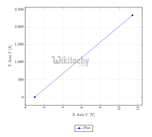
\caption{My first autogenerated plot.}
\end{center}
\end{figure}
\end{document}
learn latex tutorial - latex plots - latex example
- We added the new packages and the following code to generate the plot:
Sample Code:
...
\usepackage{tikz}
\usepackage{pgfplots}
...
\pgfplotsset{compat=newest}
\usepgfplotslibrary{units}
...
\begin{figure}[h!]
  \begin{center}
    \begin{tikzpicture}
      \begin{axis}[
          width=\linewidth, % Scale the plot to \linewidth
          grid=major,
          grid style={dashed,gray!30},
          xlabel=X Axis $U$, % Set the labels
          ylabel=Y Axis $I$,
          x unit=\si{\volt}, % Set the respective units
          y unit=\si{\ampere},
          legend style={at={(0.5,-0.2)},anchor=north},
          x tick label style={rotate=90,anchor=east}
        ]
        \addplot
        % add a plot from table; you select the columns by using the actual name in
        % the .csv file (on top)
        table[x=column 1,y=column 2,col sep=comma] {table.csv};
        \legend{Plot}
      \end{axis}
    \end{tikzpicture}
    \caption{My first autogenerated plot.}
  \end{center}
\end{figure}
...
- The first part only includes the necessary packages, the second part has only two commands as well, where
- \pgfplotsset{compat=newest} disables the backward compatibility for pgfplots, so we can place the legend of our graph below the plot and \usepgfplotslibrary{units} adds two new commands (x unit and y unit), which allows for nice formatting of units in brackets.
- Most parts from the last part should be self-explanatory. We have width, xlabel, ylabel and more.
- Comment them out and explore them on your own.
- The most important part is:
...
        table[x=column 1,y=column 2,col sep=comma] {table.csv};
...
- Given a .csv file like:
column 1,column 2
1,2
11.432,2342.23123123
- We have to put the name of one column for our x, in this case x=column 1 and a second column for our y, since there are only two columns, we choose y=column 2. Again, the col sep=comma indicates that we use comma as our column separator.
- We can copy the whole snippet as shown above and use it over and over again, we only have to change the columns we want to plot and the filename.
- There are a lot of options to style the plots and have bar charts and so forth