Material Design Lite Tabs
what is tabs in (MDL) ?
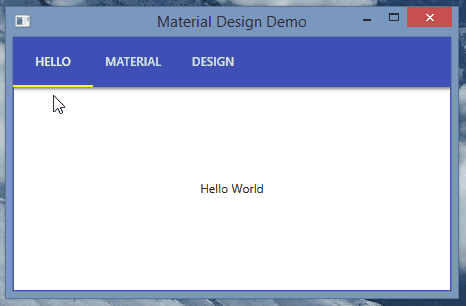
- MDL component Tabs is used to create a user interface in which different content blocks can share the same space but are mutually exclusive to each other.
- There must be at least two or more content blocks in a Tab, each tab content can have explored by switching views.
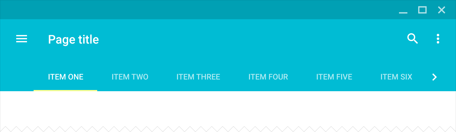
- The Name of Tab acts as a Header of the content within the tab, the active tab is highlighted using an underline.
- Tabs are very useful to show a lot of data within the limited space available on the webpage, allowing user to view different content by switching between tabs.
- Thus, Improving the User Experience Greatly.
learn material design lite tutorials - tabs examples
Creating Tabs:
- A MDL Tabs can be created using class mdl-tabs as a container for holding all related content.
- The tabs panel is created using mdl-tabs__tab-bar and panels using mdl-tabs__panel.
- The currently active tab is specified using class is-active.
Sample code:
<!-- MDL Tab Container -->
<div class="mdl-tabs mdl-js-tabs mdl-js-ripple-effect">
  <!-- Tab Bars -->
  <div class="mdl-tabs__tab-bar">
      <a href="#asia-panel" class="mdl-tabs__tab is-active">Asia</a>
      <a href="#europe-panel" class="mdl-tabs__tab">Europe</a>
      <a href="#america-panel" class="mdl-tabs__tab">America</a>
  </div>

  <!-- MDL tab panels, is-active to denote currently active -->
  <div class="mdl-tabs__panel is-active" id="asia-panel">
    <ul>
      <li>India</li>
      <li>China</li>
      <li>Japan</li>
      <li>Indonesia</li>
      <li>Pakistan</li>
      <li>Saudi Arabia</li>
      <li>Nepal</li>
    </ul>
  </div>

  <!-- MDL Tab panel 2 -->
  <div class="mdl-tabs__panel" id="europe-panel">
    <ul>
      <li>England</li>
      <li>France</li>
      <li>Germany</li>
      <li>Spain</li>
    </ul>
  </div>

  <!-- MDL Tab panel 3 -->
  <div class="mdl-tabs__panel" id="america-panel">
    <ul>
      <li>United States of America</li>
      <li>Canada</li>
    </ul>
  </div>

</div>
- The MDL provides various CSS classes to apply various predefined visual and behavioral enhancements to the tabs.
| MDL Class | Description |
|---|---|
| mdl-tabs | To Define a div element as a Container for Tabs |
| mdl-js-tabs | To assign MDL behaviour to Tab Container. |
| mdl-js-ripple-effect | To To Apply a ripple effect while switching tabs |
| mdl-tabs__tab-bar | A Container for tab Headings(links) |
| mdl-tabs__tab | To set a link as an MDL tab launcher |
| is-active | To denote the currently active tab. |
| mdl-tabs__panel | To Define an a container as a tab panel |