Material Design Lite Colors
what is colors in (MDL) ?
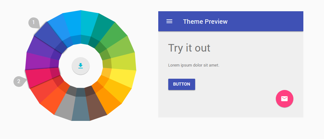
- Material Design Lite has two palette Color primary and accent, the user has an option to customize the color combination using Selector Tools.
- To Select the desired Color Combination, use the Custom CSS theme builder
Material Design Lite : Usage of Color Palettes
- In the Demo, we Create Tabs using the Color Pallete with combination of colors red and purple
- The Pattern of the color palettes in the file name is as follows material.{primary}-{accent}.min.css eg material.red-purple.min.css
Sample code: Color Palettes
<!-- Raised button , class "mdl-button--colored"-->
<button class="mdl-button mdl-js-button mdl-button--raised mdl-button--colored">
  Button
</button>

  <!-- Raised button , class "mdl-button--accent"-->
<button class="mdl-button mdl-js-button mdl-button--raised mdl-button--accent">
  Button
</button>

<!-- Raised button with ripple , class "mdl-js-ripple-effect" -->
<button class="mdl-button mdl-js-button mdl-button--raised mdl-js-ripple-effect mdl-button--accent">
  Button(ripple)
</button>

<!-- Raised disabled button , attribute "disabled" -->
<button class="mdl-button mdl-js-button mdl-button--raised mdl-button--accent" disabled>
  Button(Disabled)
</button>