Material Design Lite Switch

what is switches in (MDL) ?
- Material Design Lite(MDL) component switch is used to create an switch which is an enhanced version of HTML5 checkbox
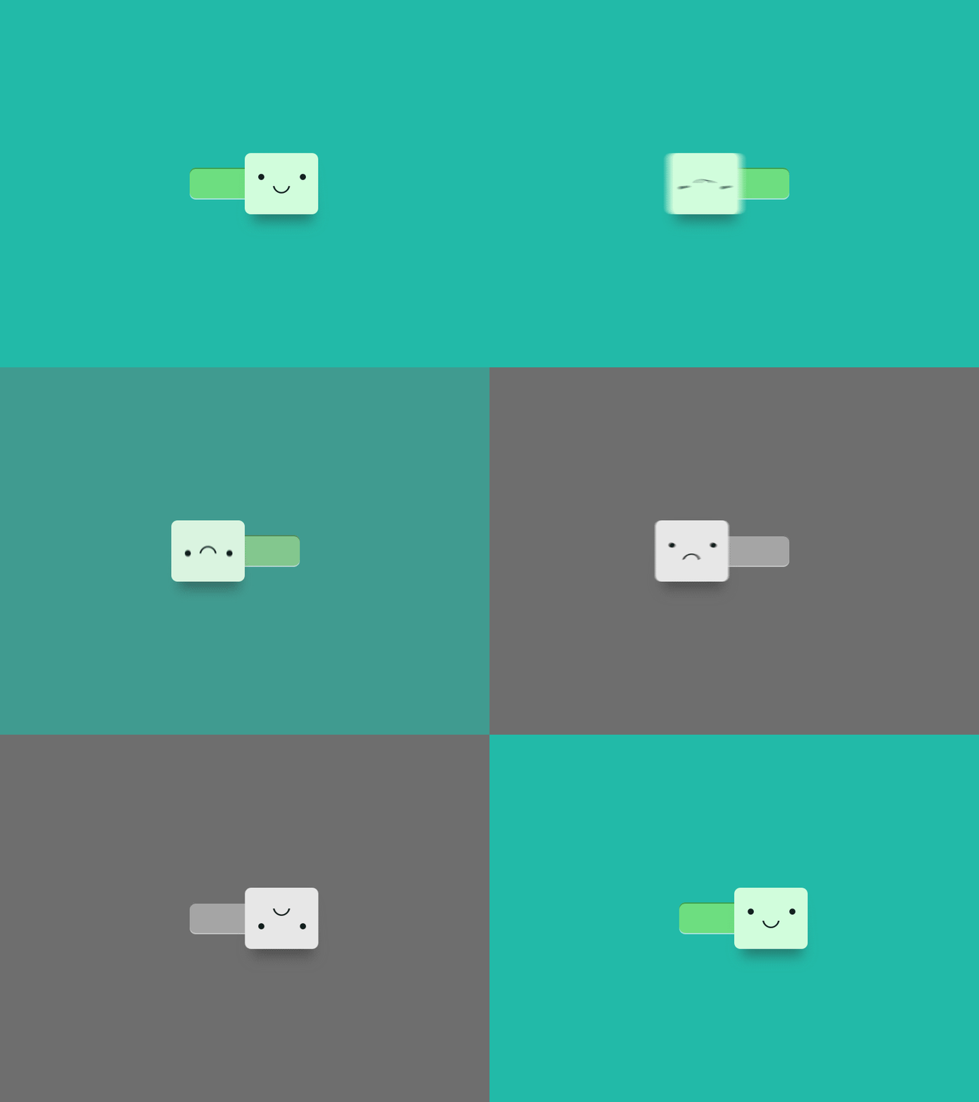
- The Visual appearance of the Switch is a short horizontal track with the circle that can be slided on either sides to denote the states(binary) of the switch.
- Radio Buttons generally appears in a groups and selections can also be made on individual basis, MDL Radio buttons have the typical click effects.
- Similar to Checkboxes and Radio Buttons, switches too are used in groups, and can be selected and unselected individually as well.
- The Visual Appearance of the Switch is far better than a normal checkbox hence enhancing the User Experience, the color of switch changes when in selected state, typical MDL click effects can also be added.
Material Design Lite(MDL) : Basic Switches
- A MDL switch can be created using mdl-switch to create a container to hold switch related content.
- To Create an icon toggle use input element with attribute type="checkbox", the attribute check is used to keep the switch in selected state by default.
Material Design Lite(MDL) : Basic Switches Material Design Lite : Radio Button Classes
| MDL Class | Description |
|---|---|
| mdl-switch | To create a MDL switch container |
| mdl-js-switch | To Assign MDL behaviour to switch |
| mdl-switch__input | To create a switch with basic MDL Features |
| mdl-switch__label | To Create a Label for switch |
| mdl-js-ripple-effect | To apply a ripple effect when clicked |
Sample Code
<html>
<head>
<title>Google MDL Switch Demo </title>
<!-- Material Design Lite -->
<script src="https://storage.googleapis.com/code.getmdl.io/1.0.4/material.min.js"></script>
<link rel="stylesheet"
    href="https://storage.googleapis.com/code.getmdl.io/1.0.4/material.red-purple.min.css" />
<!-- Material Design icon font -->
<link rel="stylesheet" href="https://fonts.googleapis.com/icon?family=Material+Icons">
</head>
<style>
.demo-switch{padding:60px;}
</style>
<body>

<div class="demo-switch">
<!-- MDL Switch 1-->
<label class="mdl-switch mdl-js-switch mdl-js-ripple-effect" for="switch-1">
<input type="checkbox" id="switch-1" class="mdl-switch__input" checked />
<!-- attribute checked -->
<span class="mdl-switch__label">Wi-Fi</span>
</label>
<hr>
<!-- MDL Switch 2 -->
<label class="mdl-switch mdl-js-switch mdl-js-ripple-effect" for="switch-2">
<input type="checkbox" id="switch-2" class="mdl-switch__input" />
<span class="mdl-switch__label">Blutooth</span>
</label>

</div>

</body>
</html>
