Angular Material - Angular Material Fab Speed Dial - Angular Material Tutorial
How to Fab Speed Dial in Angular Material?
- The md-fab-speed-dial an Angular directive, is used to show a series of popup elements or buttons for quick access to common actions.
angular material tutorials - on button click - smooth transition - view and hide buttons Example
Attributes:
| Sr.No | Parameter &Description |
|---|---|
| 1 | * md-direction This determines the direction at which the speed dial is to appear relative to the trigger element. |
| 2 | md-open This helps programmatically control whether or not the speed-dial is visible. |
Example:
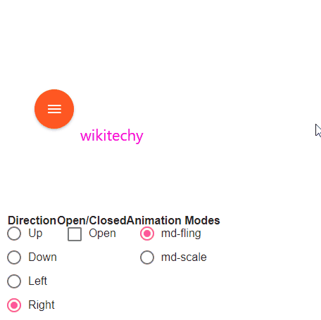
- The following example showcases the use of md-fab-speed-dial directive to showcase uses of speed dial.
<html lang="en" >
   <head>
      <link rel="stylesheet" href="https://ajax.googleapis.com/ajax/libs/angular_material/1.0.0/angular-material.min.css">
      <script src="https://ajax.googleapis.com/ajax/libs/angularjs/1.4.8/angular.min.js"></script>
      <script src="https://ajax.googleapis.com/ajax/libs/angularjs/1.4.8/angular-animate.min.js"></script>
      <script src="https://ajax.googleapis.com/ajax/libs/angularjs/1.4.8/angular-aria.min.js"></script>
      <script src="https://ajax.googleapis.com/ajax/libs/angularjs/1.4.8/angular-messages.min.js"></script>
      <script src="https://ajax.googleapis.com/ajax/libs/angular_material/1.0.0/angular-material.min.js"></script>
	  <link rel="stylesheet" href="https://fonts.googleapis.com/icon?family=Material+Icons">
      <style>
      .fabSpeedDial .text-capitalize {
         text-transform: capitalize;
      }
      .fabSpeedDial .md-fab:hover, .fabSpeedDialdemoBasicUsage .md-fab.md-focused {
         background-color: #000 !important;
      }
      .fabSpeedDial p.note {
         font-size: 1.2rem;
      }
      .fabSpeedDial .lock-size {
         min-width: 300px;
         min-height: 300px;
         width: 300px;
         height: 300px;
         margin-left: auto;
         margin-right: auto;
      }
      </style>
      <script language="javascript">
         angular
            .module('firstApplication', ['ngMaterial'])
            .controller('speedDialController', speedDialController);

         function speedDialController ($scope) {
            this.topDirections = ['left', 'up'];
            this.bottomDirections = ['down', 'right'];
            this.isOpen = false;
            this.availableModes = ['md-fling', 'md-scale'];
            this.selectedMode = 'md-fling';
            this.availableDirections = ['up', 'down', 'left', 'right'];
            this.selectedDirection = 'up';
         }
      </script>
   </head>
   <body ng-app="firstApplication">
      <div class="fabSpeedDial" id="speedDialContainer" ng-controller="speedDialController as ctrl" layout="row" ng-cloak>
         <md-content>
            <div class="lock-size" layout="row" layout-align="center center">
               <md-fab-speed-dial md-open="ctrl.isOpen" md-direction="{{ctrl.selectedDirection}}"
                  ng-class="ctrl.selectedMode">
                  <md-fab-trigger>
                     <md-button aria-label="menu" class="md-fab md-warn">
                        <md-icon class="material-icons">menu</md-icon>
                     </md-button>
                  </md-fab-trigger>
                  <md-fab-actions>
                     <md-button aria-label="Add" class="md-fab md-raised md-mini md-accent">
                        <md-icon class="material-icons" aria-label="Add">add</md-icon>
                     </md-button>
                     <md-button aria-label="Insert Link" class="md-fab md-raised md-mini md-accent">
                        <md-icon class="material-icons" aria-label="Insert Link">insert_link</md-icon>
                     </md-button>
                     <md-button aria-label="Edit" class="md-fab md-raised md-mini md-accent">
                        <md-icon class="material-icons" aria-label="Edit">mode_edit</md-icon>
                     </md-button>
                  </md-fab-actions>
               </md-fab-speed-dial>
            </div>
            <div layout="row" layout-align="space-around">
               <div layout="column" layout-align="start center">
                  <b>Direction</b>
                  <md-radio-group ng-model="ctrl.selectedDirection">
                     <md-radio-button ng-repeat="direction in ctrl.availableDirections"
                        ng-value="direction" class="text-capitalize">
                        {{direction}}
                     </md-radio-button>
                  </md-radio-group>
               </div>
               <div layout="column" layout-align="start center">
                  <b>Open/Closed</b>
                  <md-checkbox ng-model="ctrl.isOpen">
                     Open
                  </md-checkbox>
               </div>
               <div layout="column" layout-align="start center">
                  <b>Animation Modes</b>
                  <md-radio-group ng-model="ctrl.selectedMode">
                     <md-radio-button ng-repeat="mode in ctrl.availableModes" ng-value="mode">
                        {{mode}}
                     </md-radio-button>
                  </md-radio-group>
               </div>
            </div>
         </md-content>
	   </div>
   </body>
</html>