Google Charts - Google Charts tutorial - Scatter Chart with Dual Y-axis - chart js - google graphs - google charts examples
What is Scatter Chart with Dual Y-axis?
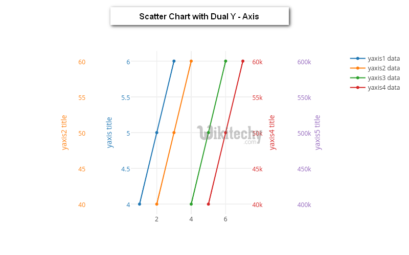
- Scatter Charts with Dual Y- axis is a type of chart which is done by using X and Y axis coordinates to display the values for X and dual Y variables
- Scatter Charts with Dual Y- Axis are similar to line graphs which are done with X and dual Y axis where they use X and dual Y axes to plot axis points
- Scatter Charts with Dual Y- Axis show us as per how much X axis is affected by dual Y - axis and the relationship between X-axis and dual Y-Axis is called correlation.
- Scatter Charts with Dual Y- Axis are used when the continuous variable of one Y axis is controlling the experiment and the other continuous variable of Y axis depends on the controlling the experiment
- Scatter Charts with Dual Y - Axis can suggest various kinds of correlations between X - axis and dual Y - axis with a certain confidence interval.
Learn google charts - google charts tutorial - google charts scatter chart with dual y axis - google charts examples - google charts programs
Configuration
- The syntax which is given below gives us the configuration of Scatter Chart with Dual Y-axis and we have used axes.y configuration to show dual y axes.
Syntax:
// Set chart options
var options = {
   axes: {
      y: {
         'hours studied': {label: 'Hours Studied'},
         'final grade': {label: 'Final Exam Grade'}
      }
   }
};
Clicking "Copy Code" button to copy the code. From - google charts tutorial - team
- The sample code which is given below show us the full sample code of scatter chart with Dual Y - Axis.
Sample code:
googlecharts-scatter-dualy.html
 Tryit<html>
<head>
<title>Google Charts Tutorial</title>
   <script type="text/javascript" src="https://www.gstatic.com/charts/loader.js"></script>
   <script type="text/javascript">
     google.charts.load('current', {packages: ['corechart','scatter']});
   </script>
</head>
<body>
<div id="container" style="width: 550px; height: 400px; margin: 0 auto"></div>
<script language="JavaScript">
function drawChart() {
   // Define the chart to be drawn.
   var data = new google.visualization.DataTable();
   data.addColumn('number', 'Student ID');
   data.addColumn('number', 'Hours Studied');
   data.addColumn('number', 'Final');

   data.addRows([
      [0, 0, 07],  [1, 1, 18],   [2, 2, 27],
      [3, 3, 53],  [4, 4, 84],   [5, 5, 95],
      [6, 6, 76],  [7, 7, 74],   [8, 8, 83],
      [9, 9, 90],  [10, 20, 62], [11, 1, 35],
      [12, 2, 50], [13, 3, 60],  [14, 4, 82],
      [15, 5, 50], [16, 6, 46],  [17, 7, 78],
      [18, 8, 86], [19, 9, 99],  [20, 2, 44],
      [21, 1, 84], [22, 2, 96],  [23, 3, 37],
      [24, 4, 40], [25, 5, 50],  [26, 6, 62],
      [27, 7, 87], [28, 8, 89],  [29, 9, 93]
   ]);

  var options = {
     chart: {
        title: 'Students\' Final Grades',
        subtitle: 'based on hours studied'
     },
     width: 800,
     height: 500,
     series: {
        0: {axis: 'hours studied'},
        1: {axis: 'final grade'}
     },
     axes: {
         y: {
            'hours studied': {label: 'Hours Studied'},
            'final grade': {label: 'Final Exam Grade'}
         }
      }
   };
   // Instantiate and draw the chart.
   var chart = new google.charts.Scatter(document.getElementById('container'));
   chart.draw(data, google.charts.Scatter.convertOptions(options));
}
google.charts.setOnLoadCallback(drawChart);
</script>
</body>
</html>