Google Charts - Google Charts tutorial - Basic Bubble Chart - chart js - google graphs - google charts examples
What is Basic Bubble Chart?
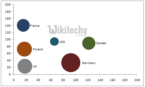
- A bubble chart is used to visualize a data set having two to four dimensions.
- The first two dimensions are visualized as coordinates, the third as color and the fourth as size.
Configurations:
We've used BubbleChart class to show bubble based chart.
//bubble chart
var chart = new google.visualization.BubbleChart(document.getElementById('container'));
Clicking "Copy Code" button to copy the code. From - google charts tutorial - team
Loading:
The google.charts.load package name is "corechart".
google.charts.load("current", {packages: ["corechart"]});
Clicking "Copy Code" button to copy the code. From - google charts tutorial - team
The visualization's class name is google.visualization.BubbleChart.
var visualization = new google.visualization.BubbleChart(container);
Clicking "Copy Code" button to copy the code. From - google charts tutorial - team
learn google charts tutorial - Bubble Charts - google charts
Data Format:
Rows: Each row in the table represents a single bubble.
Columns:
| Category | Column 0 | Column 1 | Column 2 | Column 3 (optional) | Column 4 (optional) |
|---|---|---|---|---|---|
| Purpose: | ID (name) of the bubble |
X coordinate | Y coordinate | Either a series ID or a value representing a color on a gradient scale, depending onthe column type: string A string that identifies bubbles in the same series. Use the same value to identify all bubbles that belong to the same series; bubbles in the same series will be assigned the same color. Series can be configured using the series option. number A value that is mapped to an actual color on a gradient scale using the colorAxis option. |
Size; values in this column are mapped to actual pixel values using the sizeAxisoption. |
| Data Type: | string | number | number | string or number | number |
Color By Numbers in bubble chart:
You can use the colorAxis option to color the bubbles in proportion to a value, as shown in the example below.
 Tryit<html>
  <head>
    <script type="text/javascript" src="https://www.gstatic.com/charts/loader.js"></script>
    <script type="text/javascript">
      google.charts.load("current", {packages:["corechart"]});
      google.charts.setOnLoadCallback(drawChart);
      function drawChart() {
        var data = google.visualization.arrayToDataTable([
          ['ID', 'X', 'Y', 'Temperature'],
          ['',   80,  167,      120],
          ['',   79,  136,      130],
          ['',   78,  184,      50],
          ['',   72,  278,      230],
          ['',   81,  200,      210],
          ['',   72,  170,      100],
          ['',   68,  477,      80]
        ]);

        var options = {
          colorAxis: {colors: ['yellow', 'red']}
        };

        var chart = new google.visualization.BubbleChart(document.getElementById('chart_div'));
        chart.draw(data, options);
      }
    </script>
  </head>
  <body>
    <div id="chart_div" style="width: 900px; height: 500px;"></div>
  </body>
</html>