Placeholder :
- The placeholder attribute specifies a short hint that describes the expected value of an input field (e.g. a sample value or a short description of the expected format).
- The short hint is displayed in the input field before the user enters a value.
Applies to :
| Elements | Attribute |
| <input> | placeholder |
| <textarea> | placeholder |
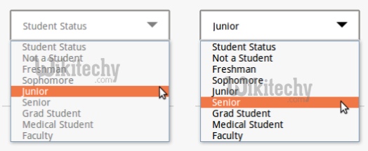
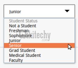
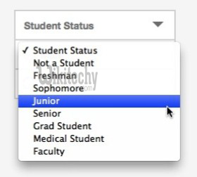
Placeholder for HTML Select box
Select boxes don’t currently support the ‘placeholder’ attribute, so here’s a workaround that works just as well.
[ad type=”banner”]The Disabled option stops the <option> being selected with both mouse and keyboard, whereas just using display: none allows the user to still select via the keyboard arrows. The display: none style just makes the list box look ‘nice’.
Note:
Using an empty value attribute on the “placeholder” option allows validation (required attribute) to work around having the “placeholder”, so if the option isn’t changed but is required; the browser should prompt the user to choose an option from the list.
This method is working in the following browsers:
Google Chrome – v.43.0.2357.132
Mozilla Firefox – v.39.0
Safari – v.8.0.7 (Placeholder is visible in dropdown but is not selectable)
Microsoft Internet Explorer – v.11 (Placeholder is visible in dropdown but is not selectable)
Project Spartan – v.15.10130 (Placeholder is visible in dropdown but is not selectable)
Strategies for Select Dropdown Lists Placeholder
The select dropdown a class called say not_chosen and style it in whatever way we want, to make the default option look like a placeholder, in this case just a different text color.
Next we use JS to traverse through all the dropdowns on the page and give them this not_chosen class if it has the default value chosen or if the user chooses the default value manually. We’re assuming the default value to be an empty string ‘ ‘
Example Program:
[ad type=”banner”]Explanation :
The dropdown will have the not_chosen class as long as the default value is chosen which means it’ll have gray color for text but as soon as it’s changed to some other option the class get’s removed and the text color fallbacks to whatever is defined in CSS for the select element (black in our case as nothing is specified).
when you try to select an option when the default option is chosen, all of them are gray because that’s what we specified for our not_chosen class.
On the other hand when an option with proper value is selected then all options are presented black.
Maybe we want to show the first option as gray and all other as black regardless of the current choice.
This piece of CSS does the trick
Although on Mac all the options in the active dropdown are always black, nothing can force them to change their colors apparently.
Implementation :
There are three different implementations:
pseudo-elements
pseudo-classes
nothing.